Aim to use images that are authentic, real and relatable to the everyday people of NSW.
When selecting a series of images, it is important to ensure the photography has a consistent look and feel – as though it has been shot by the same photographer on that day with the same lighting and camera conditions.
Pay attention to the topic and avoid any controversial images such as those showing:
- too much skin
- smoking
- drinking alcohol
- children in compromising positions
- content supportive of a political party
- content that is culturally inappropriate (if you are dealing with culturally sensitive content it is recommended to reach out cultural experts).
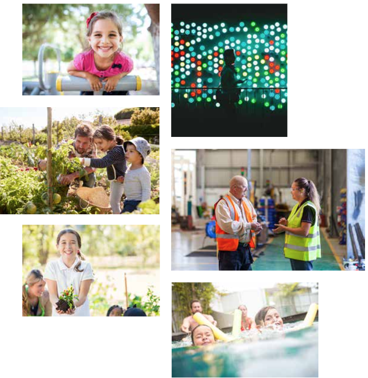
If the image subject is a person or people
It is preferable to show real people in real situations. The people need to look like they are from a NSW environment.
A diverse range of talent needs to be used in our communications. This means a variety of culturally and linguistically diverse (CALD) backgrounds need to be shown to portray the multicultural society we live in.
Clearly if focusing on a specific aspect of the community (for example, seniors, rural) choose relevant talent to represent that market you’re addressing. Be sensitive to your audience with the images you use.
Whenever possible the subject should be engaging with the audience, however, a fine line needs to be observed between the image looking staged and forced.
When choosing business photography, avoid cliched scenarios. Make sure the imagery feels natural and attainable.
If the image subject is a place
Different agencies might require imagery of locations and buildings to be the key focus.
Ensure images are:
- shot well
- good lighting conditions
- clear focal point
- not too busy
Ideally places or buildings will use perspective in the image to draw you into the image. It might benefit to pay attention to cropping the image tighter/closer to show a more interesting aspect of the location, if the image is very busy. Never use images that clearly don’t belong in NSW.
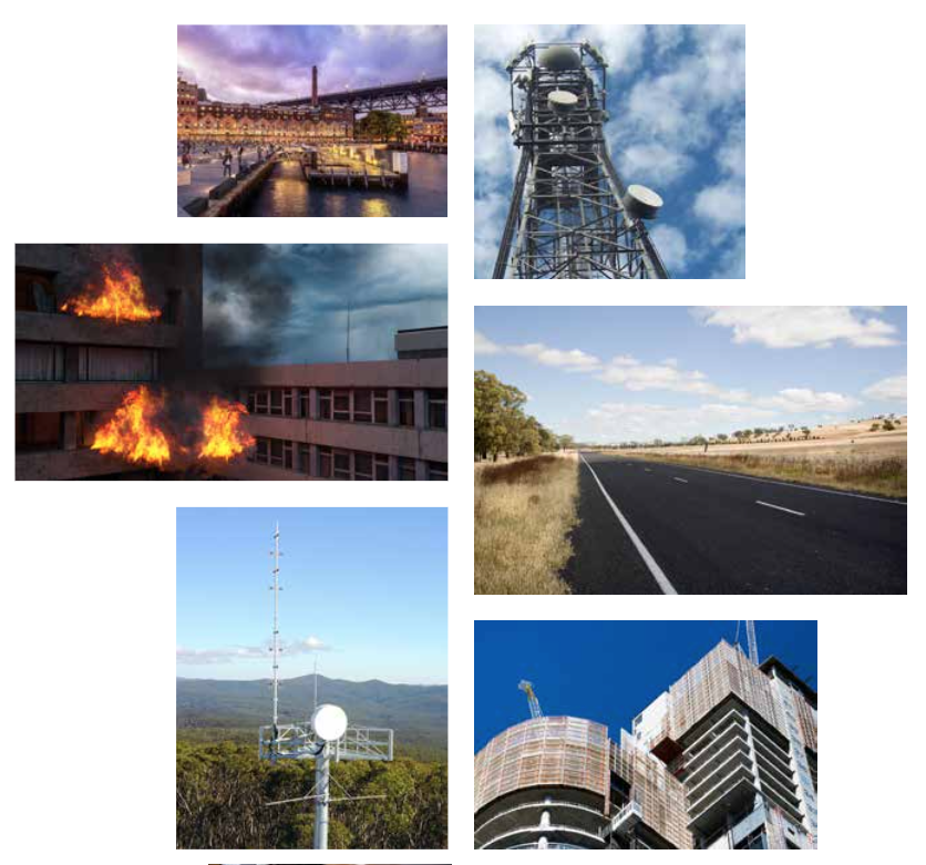 If the image subject is an object
Objects will often be used to show context to a particular message or audience. Images like these should be supporting hero images of our customers.
When using an object to be the main focus of the image always ensure it’s relevant to the topic. Don’t stray from the subject matter by using complicated, far fetched imagery.
Try to avoid stereotypical, boring images when the subject matter is quite bland – try to think outside the box to engage with your audience better. If this is ambitious, try to show the object in an interesting crop or angle.
Ensure you avoid showing any third party branding or logos. If they must appear, permission must be granted from that company.
 Composition
Any image used should contain a key focal attention point whether it’s an object or an element.
Avoid using images that are too busy or cluttered. If an image is quite busy, you can blur the background in Photoshop to avoid being too distracted, which keeps the subject matter as the main focus.
It’s important to ensure images are cropped well to show the subject. Avoid cropping people’s heads off and ensure the key focus is seen within the image.
 Colour
Full colour images that have been shot using natural, everyday light should be used whenever possible. This will help bring an honest, real feel to your images.
Black and white images should only ever be used when there’s a print requirement for these. Never use filtered or heavily saturated images.
Keep an eye on maintaining a colourful palette throughout your image choices. Try to avoid using too many images in a similar colour scheme, for example, all bright images or all muted.
 Things to avoid
Don’t embed text into an image as it’s not accessible. If images of text are used, the alt text should contain the same words as in the image.
Types of photography to avoid including duotones, over expressive, not Australian, over exposed, staged, filtered, and cliched.
Accessibility
The WCAG Guidelines focus on improving web content to be accessible by all users and we need to be vigilant in demonstrating this practice.
We must conform at a minimum to WCAG 2.2 Level AA. To align to this, you need to use the components in the systems as intended (ie without CSS hacks) to make sure pages are compliant.
Text should not be used over the top of an image. Text is not to be embedded into an image before uploading.
See Accessibility for nsw.gov.au for more information.
Further guidelines
For specific guidance on photography see the NSW Government Brand Toolbox (registration required, open to anyone with a NSW Government email address).
Need any more help?
If you have any questions, or require assistance with anything mentioned in this article, submit a request via the webform.